
Saw these signs a while back at a hobby store and just had to pick them up. The Hulk room has had little to no wall space for a long time now but that never stops me from getting new posters and signs. They then go into storage until I can have a bigger space – or take over another room in my house. There are a few things I really like about these signs, though – I have a few metal signs already – but the new ones are quite different with some classic images.

The wooden one above is my favorite because of it’s obvious nod to the corner box of comics from the 60’s – 90’s. The only thing being that this particular image was never used in any of the corner boxes – at least as far as I can remember. I’m sure someone will correct me if I am wrong… and then I will have to edit. I would have enjoyed an actual corner box image with the header and footer – even a price and issue number. That would be cool – but this is extremely cool too.

The #181 recreation is embossed – Wolvie and Hulk are both literally jumping out at you from the classic cover. Again, I would much rather it had the original coloring of the Trimpe art – there is something about the original colors that really pop and catch your eye. In a sea of books hung on the wall – this book seems to manage to grab your gaze. The recoloring is just fine – but it’s certainly not as eye-catching.


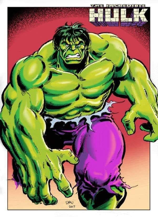
The last sign, my least favorite, is a cutout of just the Hulk. I am a little perplexed with this image. It looks like a Byrne reference – but he’s not in the purple undwear… so that can’t be it. This may actually be the original image – but I haven’t been able to locate it. So again, I go out to the masses of Hulk fans out there to try to identify the artist of this piece. What say you?


That last one is actually a Sal Buscema image from issue 223. You know it’s Sal’s by the hair really. http://i280.photobucket.com/albums/kk180/HoldyourfireAl/Comic%20Books/The%20Incredible%20Hulk/0c83ea0d.jpg
I’ve seen the first and third ones, but I’ve not seen the embossed 181 cover. Have to keep an eye out for that.
By the way, I know you weren’t too excited about the last Hulk face mug. Have you seen this one?
http://www.ebay.com/itm/New-avengers-alliance-ceramic-coffee-mugs-Mark-cup-The-hulk/181613573154?_trksid=p2045573.c100033.m2042&_trkparms=aid%3D111001%26algo%3DREC.SEED%26ao%3D1%26asc%3D20131017132637%26meid%3Dd99c631d2bba495a9f24a8665954184a%26pid%3D100033%26prg%3D20131017132637%26rk%3D4%26rkt%3D4%26sd%3D171589591942
Sal inked by Joe Rubinstein 🙂
I love the fact that they’re using all these old retro images for marketing and merchandise (especially the Sal images), but I really hate the colors they use. The colors aren’t retro at all. The late 70’s early 80’s Hulk was a yellow-green and his pants were a pinkish-purple. Today, they always make him a dark blue-green and his pants are a stark, blue-based purple. Just compare the image of the sign to the original page and you tell me which one looks better: http://s280.photobucket.com/user/HoldyourfireAl/media/Comic%20Books/The%20Incredible%20Hulk/0c83ea0d.jpg.html